
In the daily work of big data era, users often borthered by the form of data expression. For instance, large amount of data, different kinds of data, data presentation styles, and layout of charts always delay time and fail to show effective results.
As coronavirus becoming a world-concerned topic recently, governments and companies in countries have set up their own coronavirus dashboard. Do you want to make your own one by using SuperMap iPortal Web APP?
The SuperMap iPortal provides you with the out-of-the-box SuperMap iPortal WEBAPP – MapDashboard. It provides users with convenient drag and drop components and can easily build a beautiful dashboard. Mapdashboard can show the charm of GIS spatiotemporal data visualization. At the same time, it can help GISer easily build a web dashboard application with a professional map, support a variety of data types, and meet your different visualization needs. Just move the mouse like making PPT, you can get a beautiful dashboard
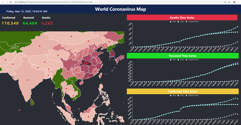
Now follow me to create your own coronavirus dashboard. Or you can watch the operation tutorial from:

Course Curriculum
| How to Make Your Own GIS Dashboard -Taking the Corona virus Dashboard as an Example | |||
| Software Preparation | 00:12:00 | ||
| Data preparation | 00:10:00 | ||
| Data Visualization | 00:12:00 | ||
| Make Dashboard | 00:10:00 | ||


Good
V.good
good course 20 - 4 - 2020 review test
good course 20 – 4 – 2020 review test